
Choosing and using the right paint colour
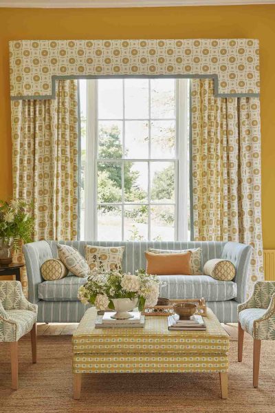
Choosing & using a paint colour
Choosing the right paint colour is important to help create the atmosphere we want in our home, and how to use it to manipulate and enhance the size or shape of our space.
To recap, the perceived wisdom is that colour schemes should have no more than three principal colours and the easiest way to combine them is to use either the ‘harmonious’ or ‘Split complementary / triadic” way. It’s worth knowing that black, whites, greys and beige are neutrals and can be added in to any scheme
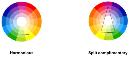
Colour can significantly alter the feeling of a space, so please consider these three guidelines when selecting your paint colour:
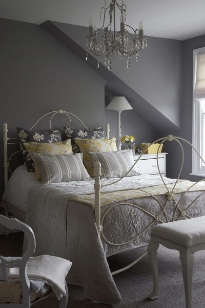
- Dark rooms make a space feel smaller and conversely light colours make a space feel bigger. You probably instinctively know this already, as dark colours make us look slimmer and white makes us look larger!
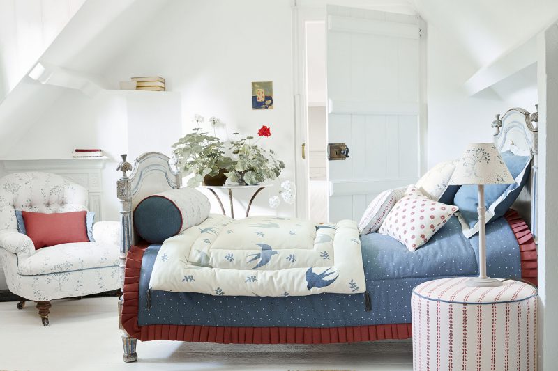
2. Warm colours will appear to come forward and cooler colours to recede. So, if you want to make a space feel bigger paint it in a light colour from the cool side of the colour wheel. Paint colours with green or blue undertones such as F&B’s Skylight or Pale Poder for example. To maximise this effect, paint the walls and ceiling the same light tone and install a pale flooring. If you want a darker colour on the walls, choose it from the cooler side of the colour wheel and paint the ceiling white to lift it away from the walls.
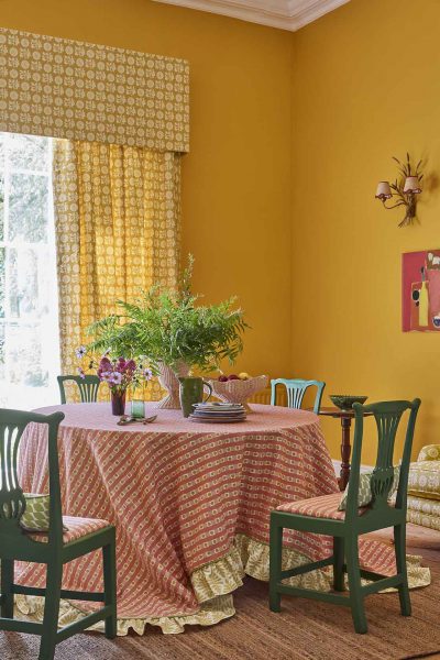
Conversely if you want to make a space feel cosier then chose a warm wall colour as these colours will advance. If you have chosen a colour scheme from the cooler part of the colour wheel, then go deeper in tone. A dark floor will also help to make the space feel smaller. You use the same principles if you want to alter the perceived size of a space. Say it has a really tall ceiling and you want to bring it down a bit. Paint the ceiling in a darker colour. Even consider bringing the colour down to the picture rail if you have one. It doesn’t need to be a really dark colour, just darker than the wall colour. If the room is long and thin and you wish to make it feel more “square” then paint the end walls in a darker colour to the two long walls. This will have the effect of moving those walls towards you.
3. Light will effect your chosen colours, so think about the following…
- Is the room north or south facing?
- What time of day does it receive light?
- When is the room most likely to be used?
- Colour has physical and emotional affect on us, here are some examples:
Red – Is invigorating and energetic, great for a convivial dining space.
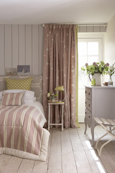
Pink – Is generally soothing, great for a bedroom.
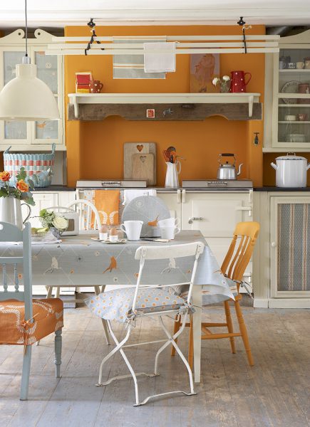
Orange – Stimulates and aids digestion! Good for a breakfast room or kitchen dinner. We have paired it here with “Duck egg” to balance out the “Pumpkin” colour and really make it pop.
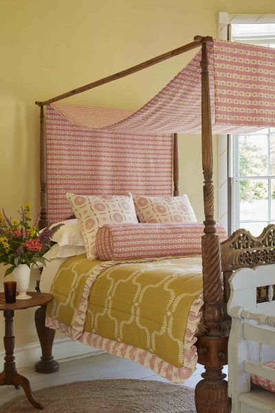
Yellow – Sunny, warm and welcoming. For some it could be over stimulating in a bedroom but for other it would kick start their day, look at this great image of a canopy bed. In our showroom we have painted an area in Little Greene “Light Gold” which pairs beautifully with our “Smoke”.
Purple – Creates a feeling of calm and stability, good for a bedroom or studio.
Blue – Pastel blues in bedrooms are calming. But is also sharpens the mind. Children performed higher in IQ tests in a blue room as it is considered relaxing on the nervous system. In this shot we have paired it with calming greens and injected a “Raspberry” accent for fun.
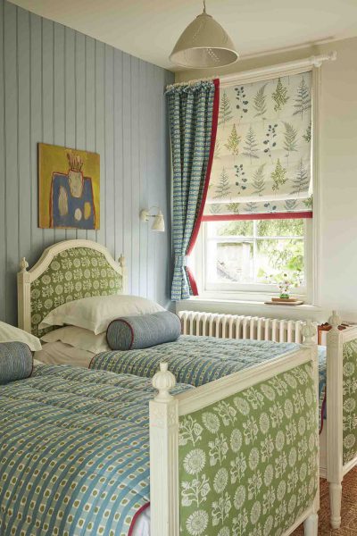
Turquoise – Creates a feeling of well-being & harmony, a popular choice for a bathroom
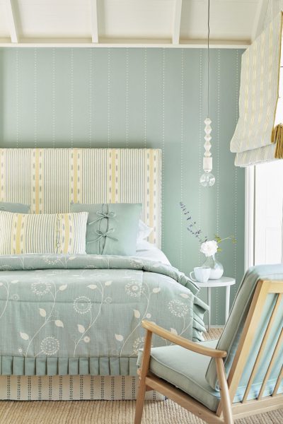
Green – A restful, nature inspired colour. Actors used to wait in “greenrooms” to steady their nerves before going on stage. This harmonious scheme below pairs Garden colour with “Teal” for a relaxing scheme.
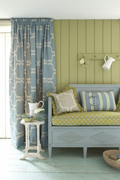
White – Is the colour of hygiene, kitchens and bathrooms. It can seem sterile and unfriendly and be a difficult colour to live with as it doesn’t absorb any colour. Off whites and pastels are perhaps a better choice. We use Hollyhock by Little Greene throughout our showroom and offices, as this works well with our fabrics, especially the base cloth that the designs are printed on which coordinates more with the Hollyhock as both are softer creams as opposed to bright white in colour.
Founder and owner of Vanessa Arbuthnott Fabrics. Vanessa creates content around fabric types, blind styles and curtain designs to best suit the needs of Vanessa Arbuthnott customers.
