
Combining Colours and Pattern
We are experts in combining colour and pattern, so we’re going to walk you through ways to perfectly combine colours and how to introduce complimentary patterns.
Table of Contents
Colour Combining
We use colour to express ourselves and to some extent we are manipulated by colour. It can influence how we feel emotionally and physically so choosing the right colours and combinations goes a long way to creating the right atmosphere in your home.
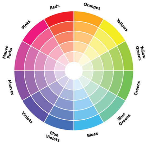
Newton invented the colour wheel which makes it easy to understand the relationship between colours.
There are Complementary colours which are opposite each other on the colour wheel and not necessarily colours that go well together (i.e. Blue and Red). They offer a strong contrast; they make each other vibrate so should in my opinion be used sparingly.
Harmonious colours are neighbouring colours on the wheel yellow-greens, greens, and blue-greens for example and as they reflect similar light waves, we find them harmonious.
Harmonious colour combining
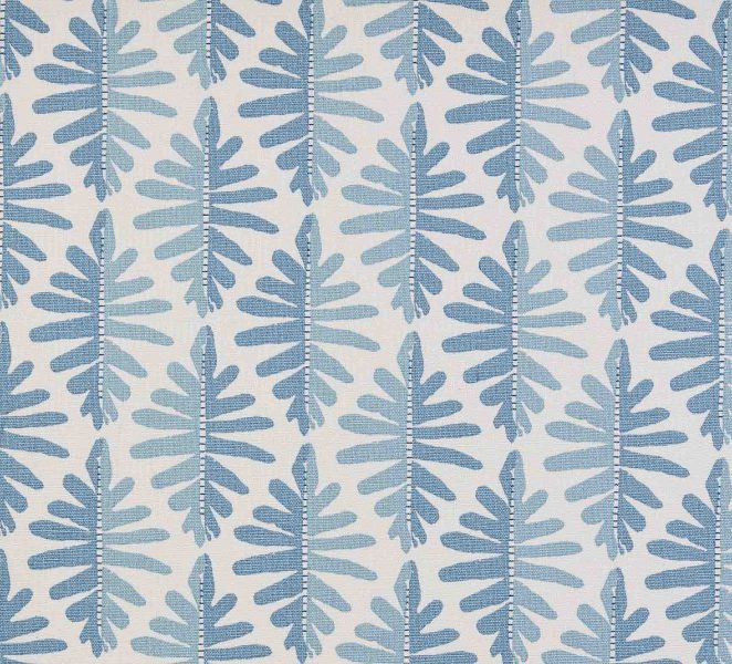
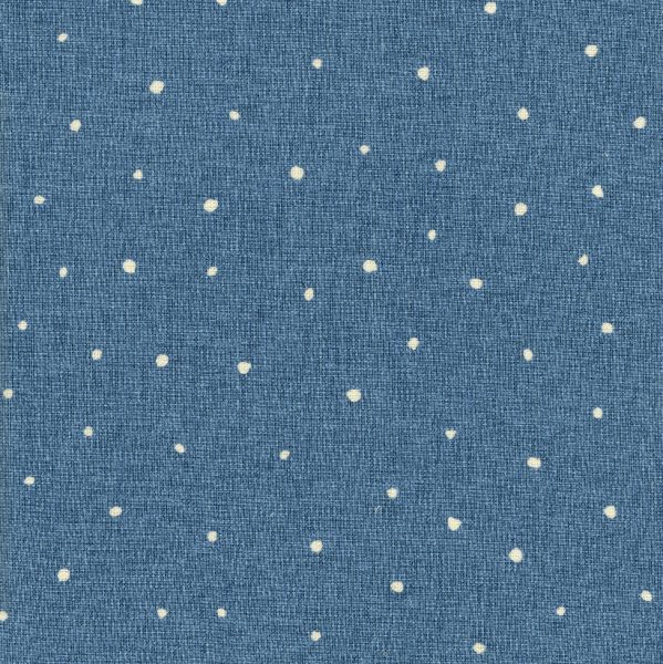
A harmonious scheme can be anywhere on the colour wheel, as long as the colours are next to each other. Here are two quite different examples of harmonious schemes. The first example uses blues & greens and as nature inspired colours will create a very relaxing look.
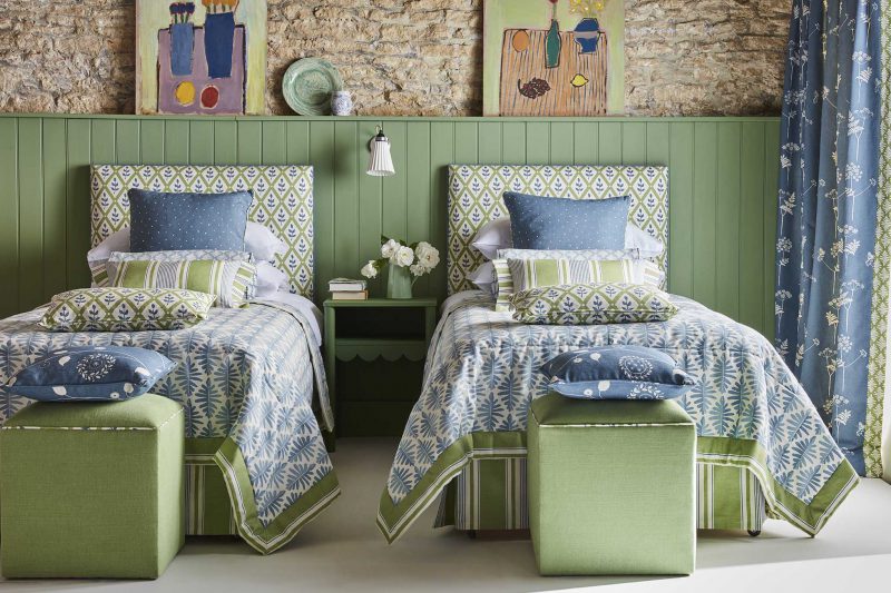
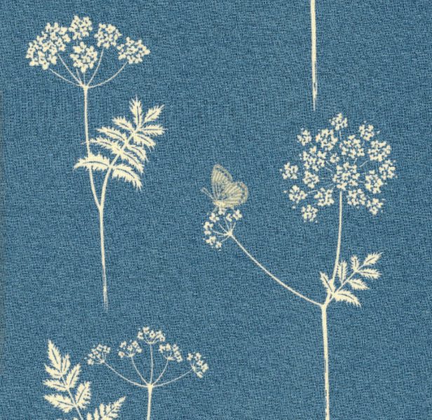
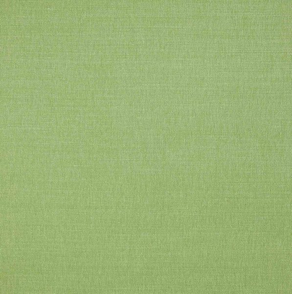
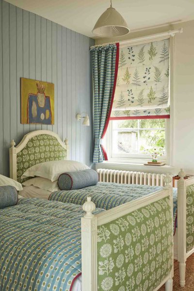
This peaceful twin bedroom example here uses the Cow parsley, Plain Dotty, and Wild Fern in shades of blue, then combining blue and green on the French Ticking valence, cushions and headboards. The cube footstools are in Plain Linen Union in Moss.
Another example of harmonious colour combining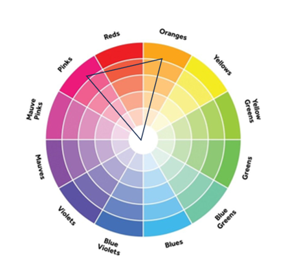
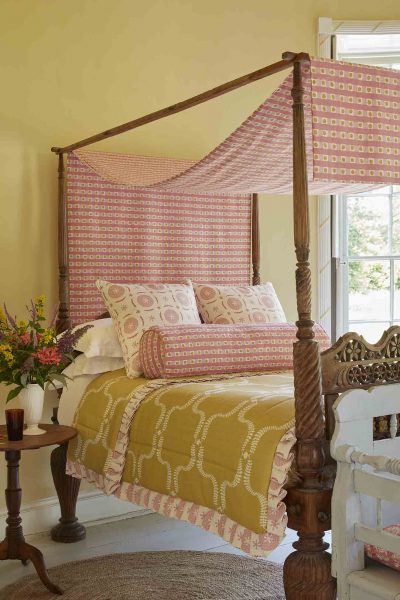
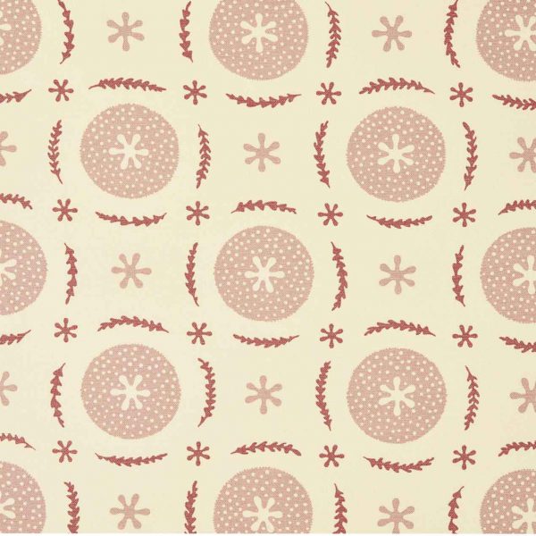
This second harmonious bedroom example, spins the triangle round to the warm part of the colour wheel, the yellows and pinks. This creates a sunny and uplifting space through its use of a soft warm yellow on the walls, Saffron coloured Up the Garden Path on the quilt, Soft Raspberry and Ochre Dotty Check on the canopy, and shades of pink in the Berries and Leaves on the scatter cushions.
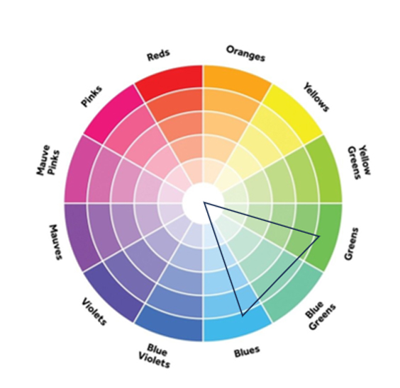
Split complementary
This is a second way to combine colours, taking two harmonious colours and one on the opposite side of the colour wheel, which is called the complement. This is a great combination to use if you think that the previous harmonious scheme (previous bedroom) looks a bit flat. The absolute key thing is to think about the ratio of the colours to combine. They should be 70% of your favourite colour, 20% secondary colour which should be close to it on the colour wheel and then 10% as the accent colour on the opposite side of the wheel.
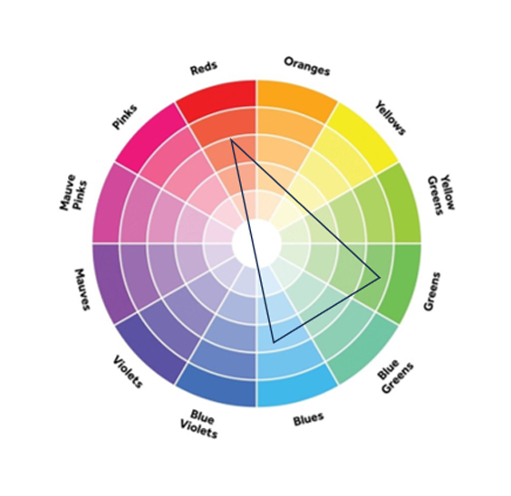
So, in this bedroom example we are using blue as the main colour (70%), green as the second harmonious colour (20%) and Red as the accent colour (10%) which makes the scheme pop!
Pattern Combining
Pattern is formed by the repetition of the same or similar shapes, lines or colours. We are surrounded by pattern everywhere, either man made or natural and again pattern has a strong influence on the atmosphere it creates. For example zig zag lines and triangles are energetic, grids are ordered, circles and wavy organic lines are relaxing. At the end of the day, we use pattern to make our spaces look attractive.
In textiles I like to consider 4 main patterns…
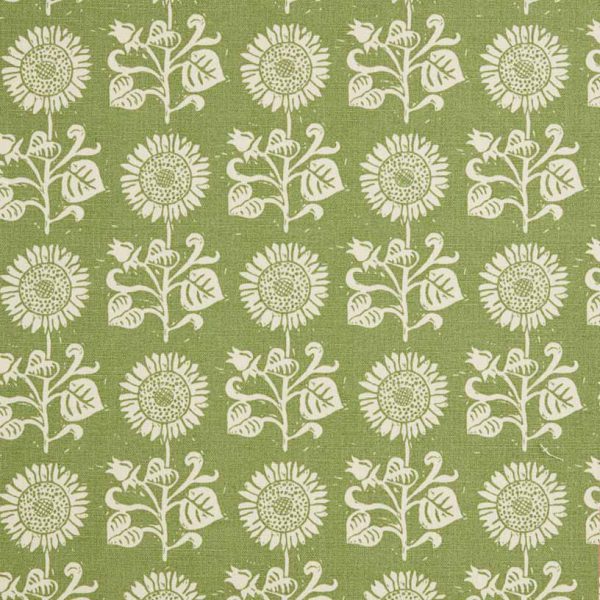
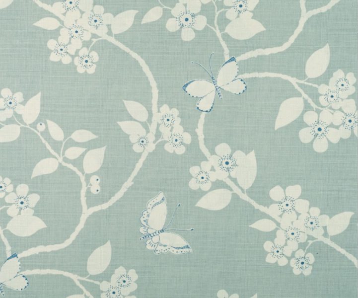
– Floral (ie Flora and Fauna – Duck Egg, Denim)
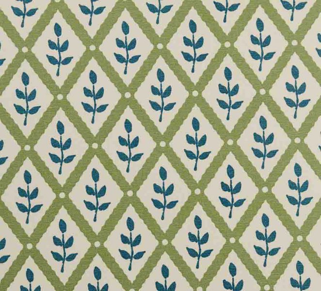
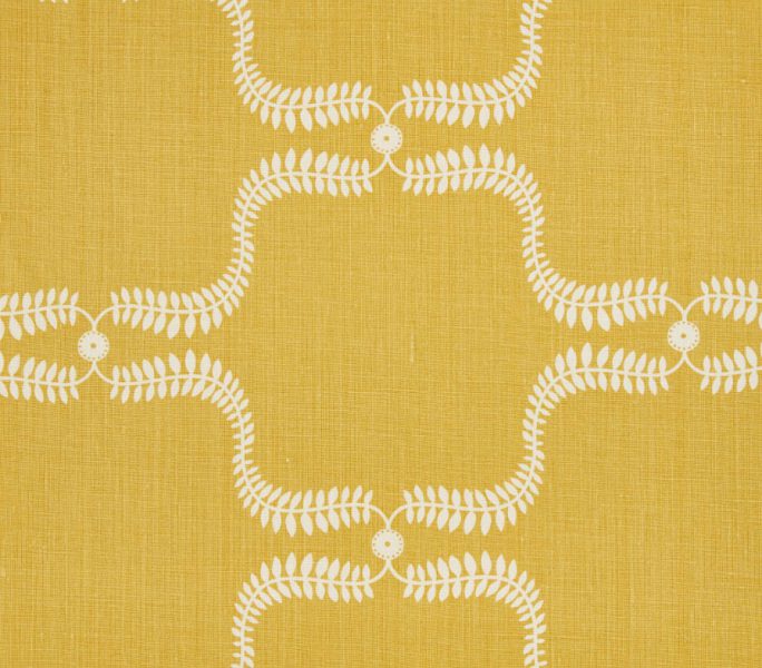
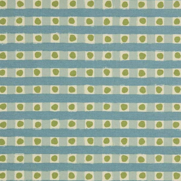
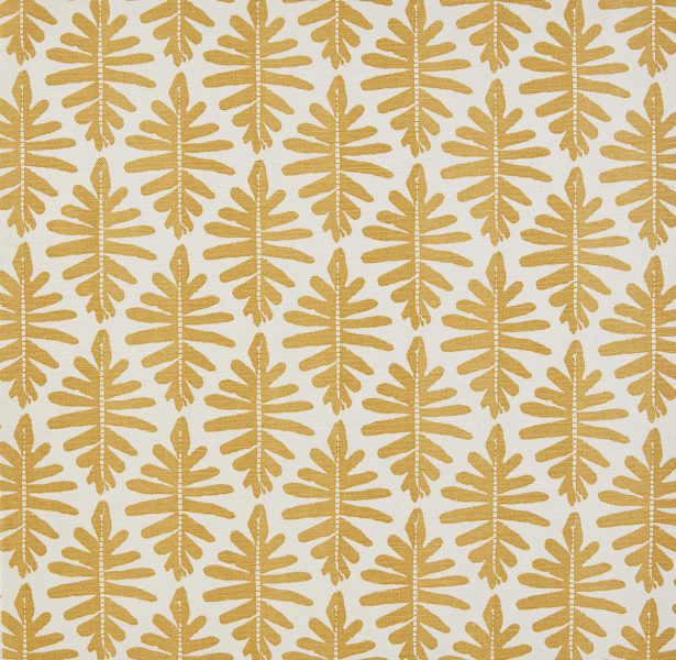
– Geometric (ie Wild Fern – Ochre)
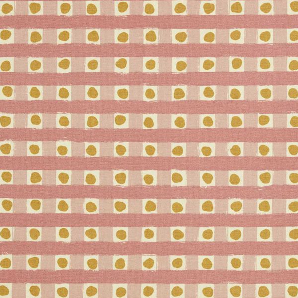
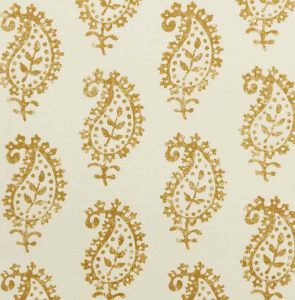
– Ethnic (ie Life and Eternity Detail – Ochre)
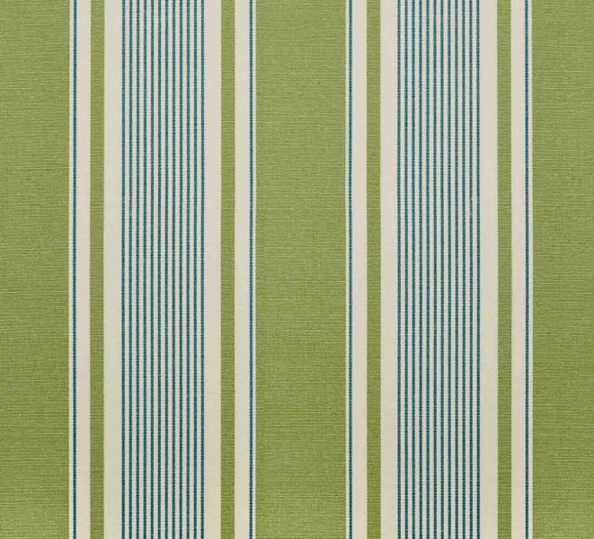
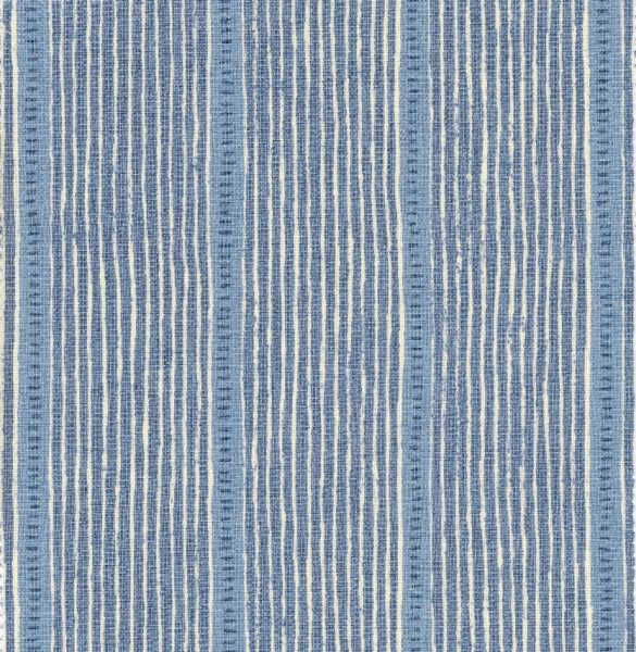
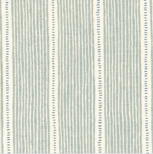
– Stripe (ie Stripe and Dash – Duck Egg, Cornflower)
As well as the type of pattern we need to consider the scale of the pattern. The scale of the pattern also elicits an emotional response and will manipulate your perception of space. A pattern blown up to a very large scale becomes very statement and graphic and we perceive it very differently to it at a smaller scale.
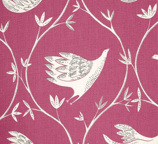
– In full flight – Damson, Winter
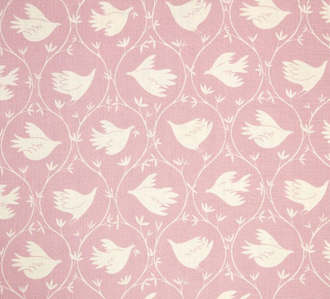
-Branching Out – Lily pink
Step 1: Choose your colour palette first using a harmonious or complementary colour scheme
Step2: Select your hero fabric, ideally comprising 3 or more colours.
Step 3: Select more patterns each containing at least one of the colours found in the dominant fabric. Different patterns will not confuse or distract for the most part if they are colour co-ordinated. Think about the atmosphere that you want to create when you are selecting those patterns.
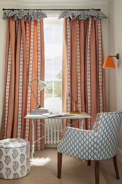
So, in this example below the striking Malmo fabric is taken as the hero fabric, combining the carrot, tomato and cornflower. The chair and the frill in the curtain are in Little Fern – Cornflower, and the circular pouffe is in Life and Eternity Detail – Cornflower. The piping on the chair is in Carrot, as is the lampshade.
If you feel after all that, that you have grasped the above and are looking to take it to a complete expert level, finally consider contrast within fabrics. We like to think of textural contrast such as the embroidered Malmo fabric above and say a Linen Union fabric. Tonal contrast, so a mix of light and dark, a mix of scale of pattern and finally the type of pattern mix.
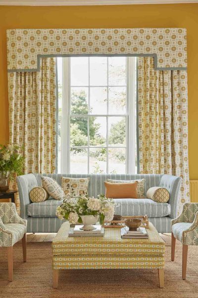
So, let us bring this all together in one final scheme. The colours below are split complementary, we have harmonious yellows and ochres and on the opposite side of the colour wheel we have Duck Egg/Smoke. The key colours are Ochre and Day Lily, on the walls, in the curtains, scatter cushions and on the pouffe. The accent colour is the Smoke/Duck egg on the sofa and the tub chairs. We have used five different patterns which read cohesively as they are in the same colour palette. We have also repeated the pattern around the room (curtains & cushions) and at different scales (chairs & bolster cushions).

Book a Design appointment with Tania!
From a daunting design project to a single window, take advantage of our in-showroom, or WhatsApp video consultations with Tania, our Interior Designer, free of charge.
Please call us, or use the link to book your 30-minute WhatsApp video call.
Founder and owner of Vanessa Arbuthnott Fabrics. Vanessa creates content around fabric types, blind styles and curtain designs to best suit the needs of Vanessa Arbuthnott customers.